This week’s prompt has us critiquing the design elements of a site we frequent. I thought I would examine the blog that inspired me to start my own… Aestas Book Blog

Mauve Pagé highlighted the basic design principles as Balance, Rhythm, Proportion/Scale, Contrast/Point of Focus, and Unity.
- Balance: Aestas’ blog is very symmetrical, as the middle menu bar featuring specific book covers is even, three on each side. Her title/logo is also centred. This symmetry is very pleasing to me, I really like that feature of the design.
- Rhythm: Aestas uses consistent typefaces throughout her blog. She has the colour palette of black, white, and beige that she doesn’t stray from. She cannot have a more colour palette as she is limited to using something that will complement any book cover appear on her site. I personally would not have gone with the beige, as it can clash with some book covers.
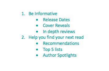
- Proportion/Scale: Aestas creates emphasis by having a larger button for entering her database, which is the standout section of her website. She also emphasizes her latest reviews, new releases, current sales, upcoming books, top favourites, and giveaway pages as she accents them with images and they are a pretty substantial size.
- Contrast/Point of Focus: Through her design choices I would say Aestas wants you to check out her database, then click on a category on her menu bar, then check out her out on different social platforms. By doing this you ingest her content all points. I find that she has done this very effectively.
- Unity: I would never accuse Aestas of disorganization. Her blog is so incredibly organized and her design allows for it.
I worked on the design of my blog as well. Mauve Pagé really got me thinking about loading time. I downloaded a plugin that allows me to control which pages widgets show up on. So now all my widgets show up on my home page and fewer widgets appear once you are inside my blog, reading and viewing my content. Having fewer images load will decrease wait time, for my audience. I purposely kept my subscription and contact widgets, to ensure my line length is reasonable and so that at any time an audience member can either subscribe or contact me.