The post Peer Review #3: Train, Eat, Sleep, Repeat: An Exploration of the Fitness Lifestyle appeared first on ClaryNathanWill.
]]>
Content
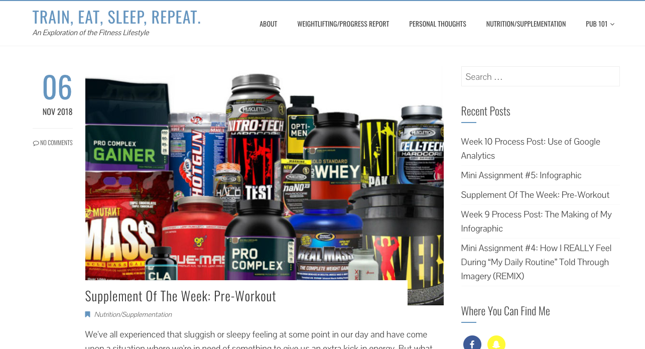
Chris mentions that he is not an expert specifically saying that he is not “a personal trainer or gym expert.” Due to the effect of minimizing authority that John Suler explains in his piece The Online Disinhibition Effect, it does not matter that Chris is not an expert as the internet minimizes the authority of an expert and further validates the personal accounts Chris provides. The content Chris produces is well informed, his use of hyperlinks is superb. Looking at the posts from a reader’s perspective, someone who does not frequent a gym, but rather a yoga studio, Chris writes in such an easy to comprehend way no matter the level fitness enthusiast you are. The posts do seem a bit long, but I do like the use of photos to help break up large chunks of text.
Chris has built an online persona, as someone who prioritizes their fitness and health. This prioritization is essential for the goals Chris has in his life. I think the blog would benefit from Chris’ about section being on the homepage rather than on page that must be clicked on. I would suggest placing it in the sidebar. It would allow for Chris to be upfront about not being expert and would complement the progress and journey nature that so many of Chris’ posts appear to be about. I thought the about was so well written, why hide it and make it harder to access.
Design
The design of Chris’ blog is clean and simple. This stylistic choice lends itself nicely as it allows for the content to shine. Now I will evaluate the blog based on points from our classes design lecture with Mauve Page:
- Balance: The blog is slightly asymmetrical which is a nice touch as the blog posts are bigger, cementing their importance on the site.
- Rhythm: The colours and typefaces are consistent throughout the blog. I like the use of colour in the body texts of posts to help emphasize certain things, such a nice touch.
- Contrast: The large pictures that accompany each new post are eye-catching and are the point of focus in my opinion. The next thing that my eye is drawn to is Chris’ recent post widget in the right sidebar. It is a nice touch, but right now it is full of Pub 101 work including Process posts, I think a reader who came just for fitness content would benefit from having fitness-themed posts easily accessible in the sidebar.
- Unity: The blog has an overall organized feel and all design elements are consistent throughout.
- UX/UI: I found at least with my wifi that the blog loaded efficiently despite large images. I looked at the blog on a mobile device and I loved how easily traversable it is in that form, I love the drop-down menu. One thing though is the Facebook button leads to Chris’ personal account rather than a page centered on the blog. You might want to not have your readership bombard you with friends requests, but rather have them like a page.
Overall the design for the blog suits the content and is great from a user usability aspect. The blog is very clear, has good navigation and great a great loading speed.
The blog’s content and design work in unity to display Chris’ fitness journey, and lend itself to inspiring others to try the same. Good luck with all your goals Chris, great blog!
The post Peer Review #3: Train, Eat, Sleep, Repeat: An Exploration of the Fitness Lifestyle appeared first on ClaryNathanWill.
]]>The post Peer Review #2: Grace in Adulting: True Tales of a Clueless Adult appeared first on ClaryNathanWill.
]]>In Tara Chittenden’s Digital Dressing Up: Modelling Female Teen Identity in the Discursive Spaces of the Fashion Blogosphere, she refers to blogs as, “online diaries.” From looking through and reading Grace’s blog it reads like I am receiving insight into what she would write in a diary. I love the persona she has built, how she is open about her struggles, and who she is on such a public platform. This second peer review is geared toward design choices though, so I will depart from talking about content.
In terms of Grace’s themes and customization, I really like her theme choice. The theme is clean and simple, it allows for Grace’s content to shine. With the content being so personal and engagingly written it really benefits from having the space to shine. Looking at the original uncustomized version of Grace’s theme I really see that she has made some changes to it, and her theme feels distinct from the original. The colour (the bold red), the font, and the designs on the right side all enhance the blog making it more personal, more Grace. In Travis Gertz’s Design Machines he discusses “copycat culture,” which is something Grace avoids through customization, the bold colour is her, the text choice is her, the Instagram feed is her. The way in which she writes screams this bold red she has used, the colour and her content complement each other so much.
When it comes to Grace’s typography choices, I am unsure about the mixing of serif and sans-serif fonts. I really like the typeface of the blog title and the shadow on the letters, but I am unsure if it complements the typeface of the body text. I would recommend previewing some different fonts to see if there is a better complimentary pair.
Grace’s layout resembles that of a standard blog. The menu bar placement is great, my concern about it lies in the fact that when you hover over the category, you see all the posts in that category. This will just get cluttered as the weeks go by. This could be amended by having sub-categories, check out this example:

When you hover over Pub 101 for example, you see Process Posts, Assignments, and Peer Reviews as sub-categories. This can be done in the menu bar customization, it should look something like this:

Grace has integrated social media into her blog. I love the Instagram feed in the sidebar as the blog is so personal, and the content benefits from Grace’s personal images. The pictures really complement the mood and feel of her blog. The Twitter widget is not sized correctly, I recommend fixing that.
Now to look at Grace’s site structure. In the footer, there are icons that appear to be links, but they bring you to parts of the blog that can be accessed in the menu bar. I think it would be more constructive to have them as social media links, or maybe a link to subscribe. The about section does not need rewording, but it needs reworking. Similar to how #posiel in the menu bar drops down to many posts, the about section does not need to have a drop down element to it. Either about should be clickable and bring the reader to the words and images Grace has curated or the about can go in a sidebar, to eliminate having to click on a button.
To end with the usability of the site. As Mauvé Page stressed in her lecture, one has to examine their loading time and make adjustments to ensure things are not taking forever to load. The loading time was great, it was efficient and even. Grace has not cluttered the blog with too many images or graphics so she avoids an uneven loading time of text and images.
Grace has already moulded an online persona and is doing a great job on putting out content regularly. To make her blog even better, she needs to address some technical problems, especially in the main menu bar feature. I am looking forward to reading about what happens next to Grace, and I wish her a speedy recovery from Shingles (oh gosh, I feel so bad for you. I did not even realize you could get them at nineteen).
The post Peer Review #2: Grace in Adulting: True Tales of a Clueless Adult appeared first on ClaryNathanWill.
]]>The post Peer Review #1: Explore: An Industry Voice appeared first on ClaryNathanWill.
]]>Central to this first peer review is the creation of Online Self. Doug’s about section can be found in the menu bar and is quite simple.

In order to build an online self, I really think Doug would benefit from updating his about section. Either, if you plan to keep it short and sweet build it into the home page instead, I would suggest also adding social media handles somewhere on the homepage as those accounts can greater demonstrate who Doug’s online self is. In John Suler’s The Online Disinhibition Effect, he discussed putting up self-boundaries and feeling guarded online. I really feel this boundary when I look at Doug’s about section, as I do not really feel as if I know Doug much at all. Doug elaborated more on himself on a past process post, and I think the about section would really benefit from some of the content of that post being transferred to the about section.
Let’s switch now to the design so far. I like simplicity in blog design, as it allows for the content to shine. I really like the colour choices, typefaces, and WordPress theme Doug has chosen for the blog. I do not understand the connection between image and the content of the blog. The tagline “An Industry Voice” also requires tweaking as on first glance, the reader will be unsure about which industry Doug is discussing.
Doug has uploaded one hotel review:

As someone who also does reviews, first off I love having the scoring system and the overall rating. It will be so handy when comparing to other hotel reviews on the site. The review lacks visuals though. Any audience today, is just getting less and less willing to read plain bodies of text. Rather than visually explaining different aspects of a hotel, such as the pool and gym, pictures of these places would elevate the reviews. Whenever I book a hotel I am usually persuaded by ones that have comprehensive image galleries. Incorporating images into the hotel reviews I believe will attract a larger audience, and most importantly keep them on the site.
Doug is quite knowledgeable, the written content demonstrates that beautifully. Areas of improvement fall in the creation of online self, design, and visual content. Upon further refinement, exploredoug.ca will be the first place I check the next time I am booking a hotel.
The post Peer Review #1: Explore: An Industry Voice appeared first on ClaryNathanWill.
]]>